Homepage Main Feature

A configurable component built for Best Buy's Content Management System (CMS).

Overview

The homepage is the front door where many customers will begin their browsing experience. With a goal to make a better first impression - and also to not drastically increase the amount of work for our internal business users - our product team incorporated a number of design enhancements to the carousel component that's leveraged at the top of the homepage.

Role

User Interface Designer

Products

Site Content

Date

2023

Homepage of BestBuy.ca on a mobile device

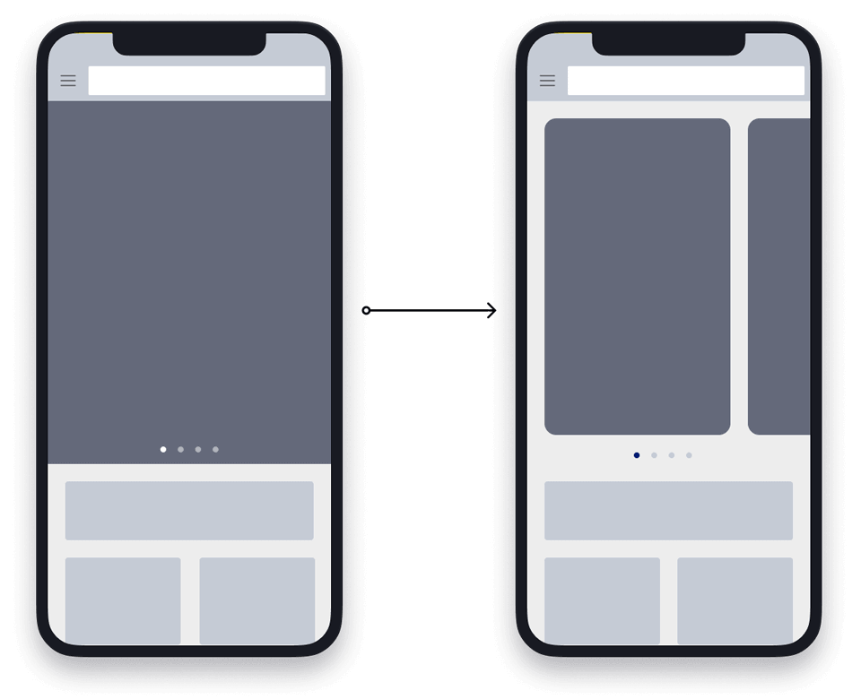
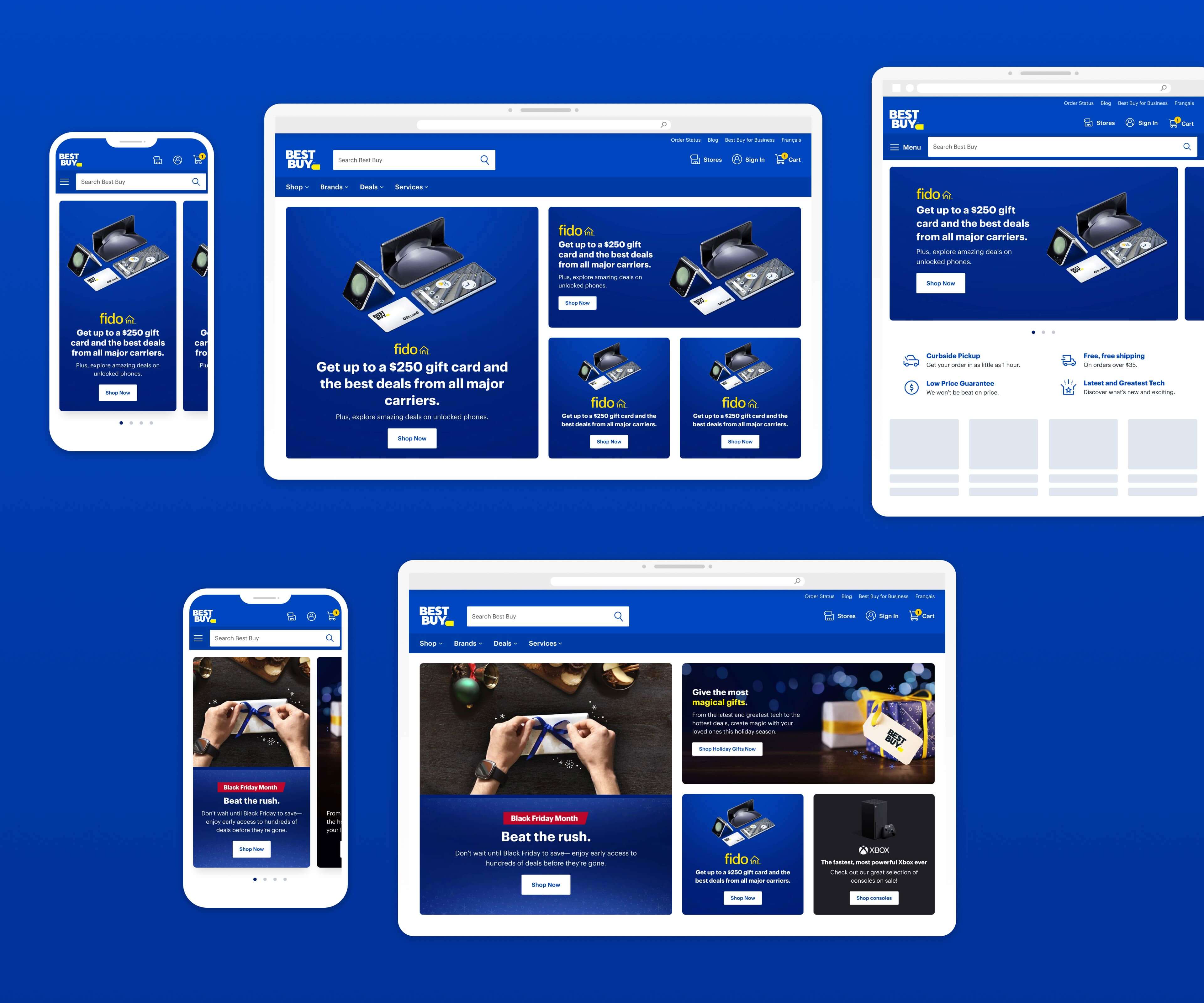
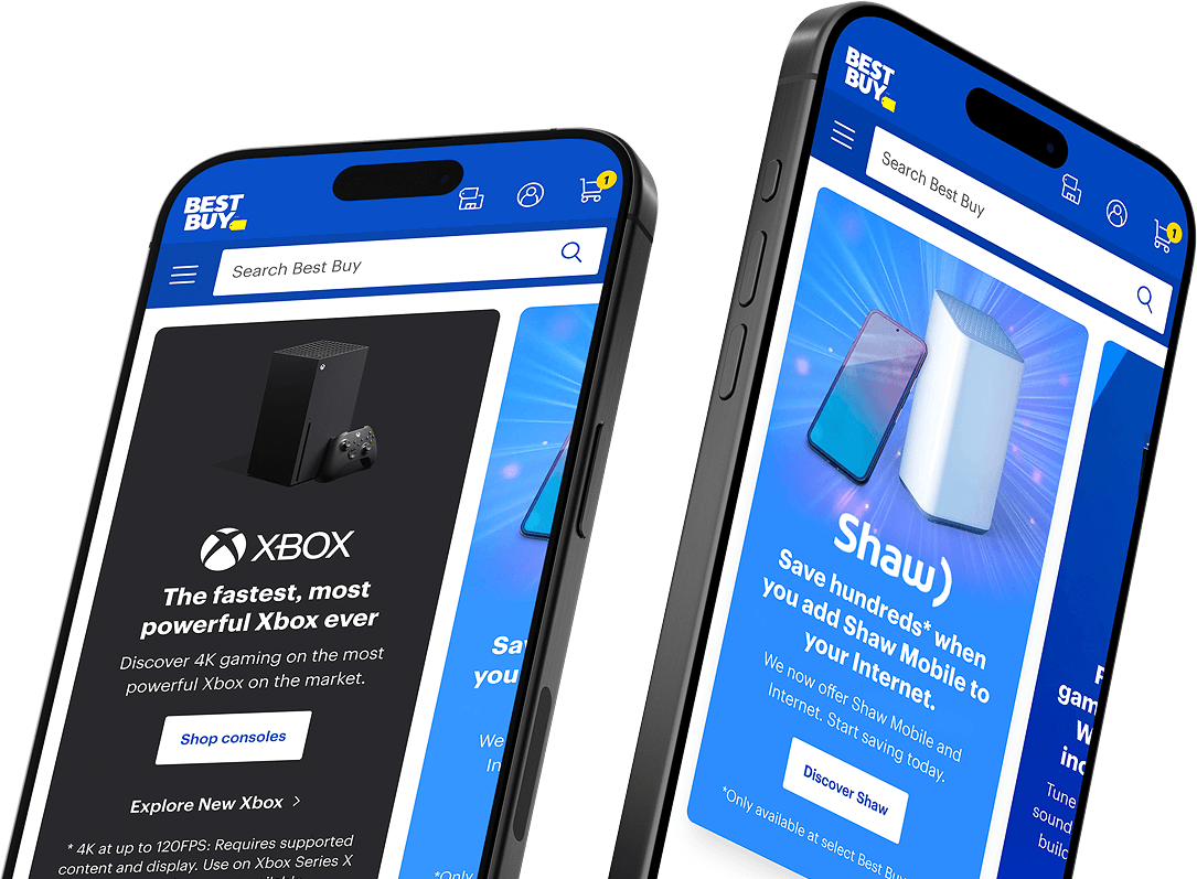
The problem to solve

When a standard carousel was used on the homepage, our data showed that engagement and impressions on the secondary slides were fairly low. We believed that many customers didn't know they could engage with the component to see more content - due to the lack of affordances that came with a standard carousel design pattern.

With that in mind, we wanted to explore different ways we could improve the performance of this feature by making it clearer to users that additional content was available. Also, since this was an existing CMS component with templates being used by a number of other teams, we needed to ensure that any changes we made would work with those existing frameworks.

How are we solving it?

Displaying cropped cards on mobile devices

In the previous iteration of the carousel, the only visual indicator that more content was available were the pagination dots at the bottom of the component. As a design enhancement, we proposed that we display each of the slides as a card - with the next one partially cropped at the edge of the screen. This is a common design pattern on touch screen devices that has a strong affordance that more content is available.

Mobile Wireframe

Displaying a grid on desktop devices

For larger devices, all of the content would be displayed in a responsive grid instead of using a slideshow. By taking this approach, the user can see everything without needing to take any action.

Desktop Wireframe

Ensuring compatibility with existing assets

Since this was a CMS component that was being used by multiple teams in different departments, one of our goals was to minimize the amount of additional effort for our internal users. There were already processes and templates in place for those teams, and we didn't want to introduce a number of new requirements in order for them to use this new feature.

For that reason, we made sure that the new card and grid displays were able to use the current assets that these teams are already creating - such as foreground and background images - instead of requiring them to provide new assets.

Feature Specs
Final Design

Impact

After releasing this iteration, we ran an observational analysis of the homepage performance over a period of 6 promotional weeks and compared it to how it performed before the changes were made.

The overall engagement increased by 76% on desktop devices displaying the grid, and by 25% on tablets and 29% on mobile devices with cropped cards. Another indication of improved performance is evident by a 4% increase to product pages in the segment of users who interacted with them, across all devices.

76%

desktop engagement

29%

mobile engagement

25%

tablet engagement

4%

visits to product pages